How to make YouTube thumbnails that get attention
Simple composition, quick reading, and a visual promise that matches the video.
A thumbnail does not need to explain the entire video. It needs to make a clear promise in less than one second, inside a tiny area surrounded by dozens of other images. The first goal is not to pile on effects: decide what people must understand before they even read the title. A face, object, transformation, or short word can do that. Five small ideas fighting for attention cannot.
Four examples: what each layer is doing
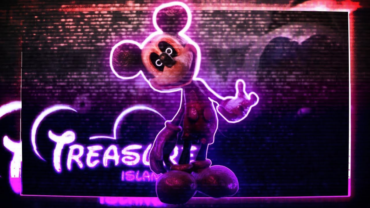
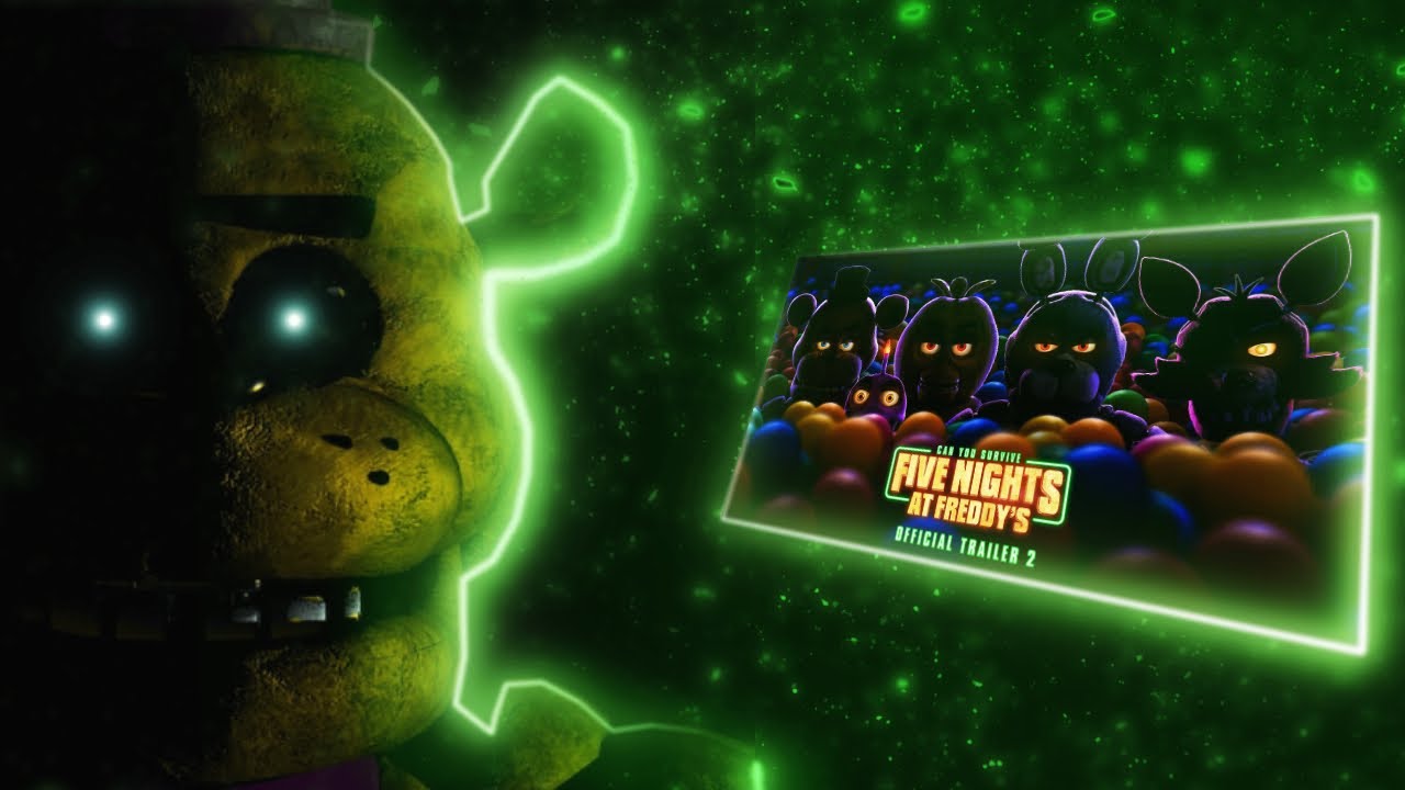
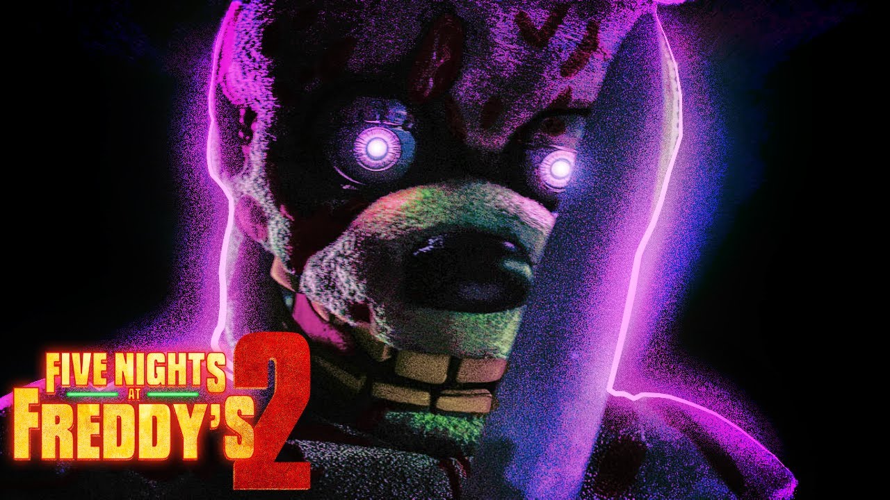
These thumbnails show a useful workflow: first the subject must be recognizable; then the neon outline separates it from the background; finally, colored lighting reinforces the scene direction. The glow is not decoration placed on every edge: it builds focus and depth.
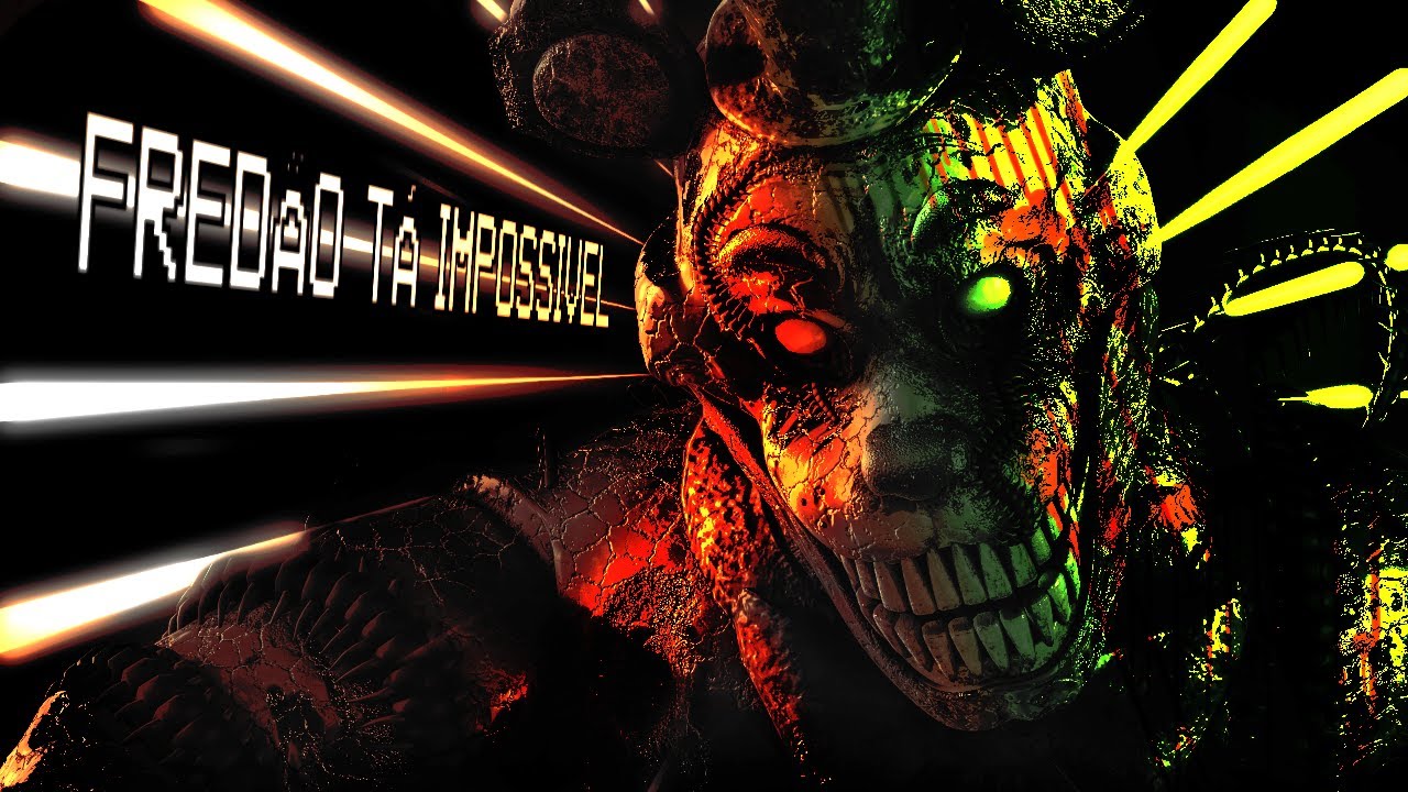
1. Choose one message before opening the editor
Write the thumbnail idea as a short sentence: “character in danger,” “before and after,” “impossible result,” “rare object,” or “quick tutorial.” If you cannot summarize the promise, the visual will probably be confusing too. Then choose one dominant element: an expressive face, object, result, or word. Everything else should support that focus.
2. Build hierarchy: subject, contrast, text
The eye should find the main subject first, then the contrast that makes the scene interesting, and only then text. Make the cutout clean, scale the person or object until it owns meaningful space, and leave negative space for reading. A detailed background can be darkened, blurred, or simplified; if it has more contrast than the subject, the thumbnail has lost its job.
3. Use text as an amplifier, not a script
Thumbnail text works best when it completes the image in two to four words, not when it repeats the whole title. Use large type, high contrast, and clean space behind letters. If the phrase must be tiny to fit, it likely belongs in the video title or should be removed. Test at 25% zoom or phone size: if it does not read immediately, cut words and increase visual weight.
4. Color and light need a purpose
Choose a short palette: one dominant color, one contrast color, and neutrals for breathing room. Red and orange tend to add urgency; blue and purple support technological or night contrast; green can communicate strangeness, energy, or sci-fi. Colored light needs an origin and direction. If it comes from the left, light left edges and let the right side breathe; directionless light is only a filter.
5. Make versions that are genuinely different
Do not make three nearly identical copies with only a different text color. Compare one version with a larger face, another with a larger object, and a third with a simpler framing. View them reduced and side by side, as they would appear in search or a feed. The best one is not always prettiest full-size; it communicates fastest without promising something the video does not deliver.
6. Export for the actual destination
Keep the editable file before flattening layers. Export at the format and file weight suited to the platform, then open the final file and check sharpness, text, and shadows at small size. Do not repeatedly compress the same JPEG: keep the original and make a final copy for each destination.
Want to apply the neon and lighting from the examples?
The neon outline guide shows every Photopea step: Pen Tool path, Stroke Path, Outer Glow, three Gaussian Blur levels, and the Brightness layer. It also explains how to adapt the approach in Photoshop, GIMP, Krita, Affinity Photo, and Procreate.
Open neon outline tutorialA simple rule to avoid visual clickbait
A thumbnail can increase curiosity, but it should not promise something the video cannot deliver. When image and content match, you attract the right viewer and build trust for later videos.
 Converter Lab
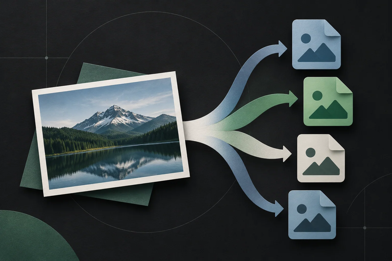
Image converter
Convert batches of photos, artwork, and icons into formats for your destination.
Background Remover
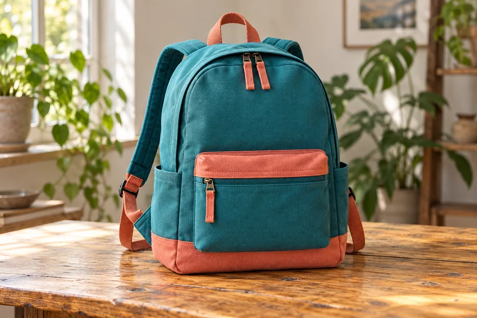
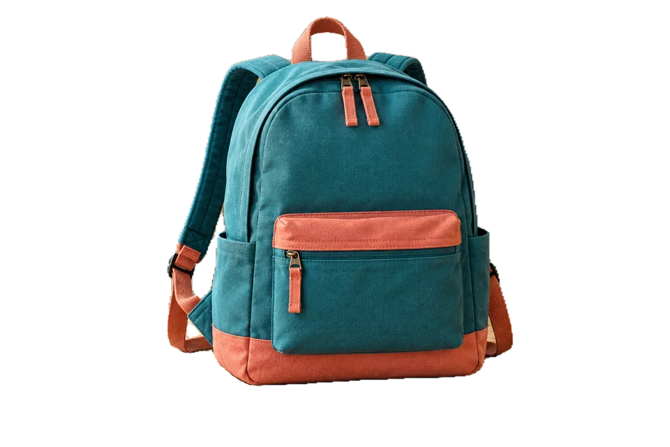
Remove backgrounds from people, products, and objects with an adjustable mask. Use BiRefNet Lite for varied objects and export transparent PNG or WebP.
AI Upscaler
Enlarge photos, illustrations, and anime with AI models, before-and-after comparison, and batch processing.
Image Compressor
Reduce the size of photos, graphics, and images with visual comparison, adjustable quality, and batch processing.
Image Resizer
Resize image batches by pixels, percentage, or maximum limits. Adjust aspect ratio, framing, and output format.