How to create a neon outline and colored lighting in Photopea
A visual workflow for making people, objects, and characters stand out in thumbnails, artwork, and covers.
What people often call a “neon effect” is not one filter. It is three decisions working together: an outline that separates the subject from the background, an aura built with blurred duplicates, and painted lighting that explains where the light comes from. When those layers agree on color and direction, even a small thumbnail stays readable. This guide uses Photopea, but the visual logic works in Photoshop, GIMP, Krita, Affinity Photo, and any editor with paths or selections, layer styles, blur, and blend modes.
The effect in thumbnails, covers, and artwork
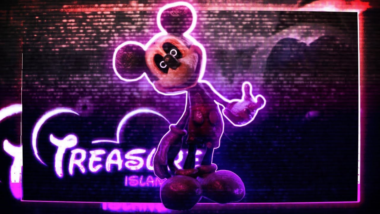
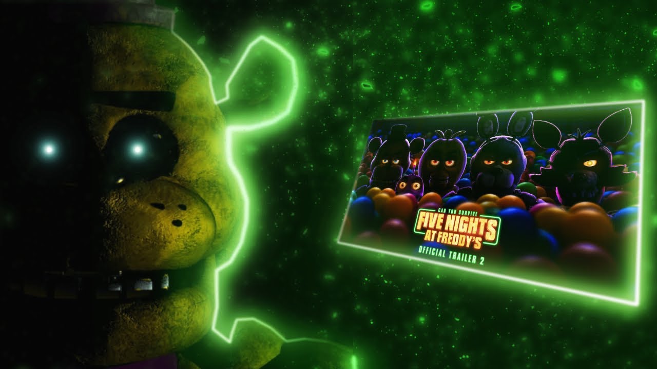
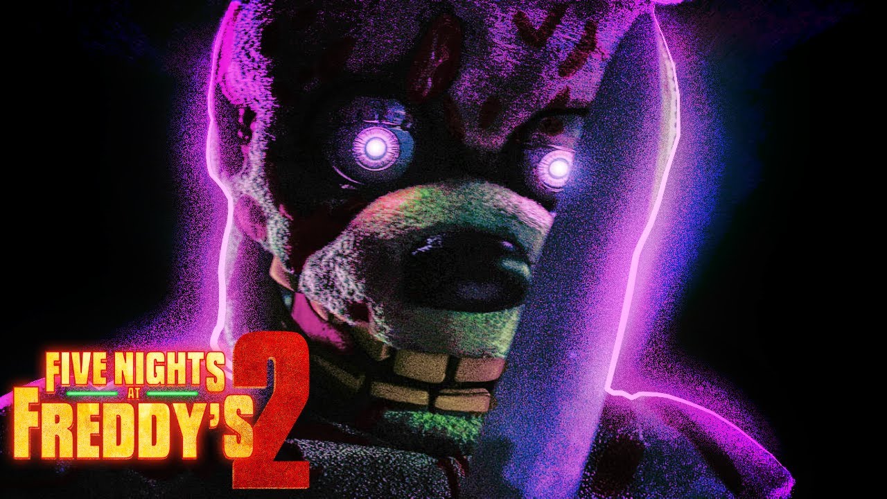
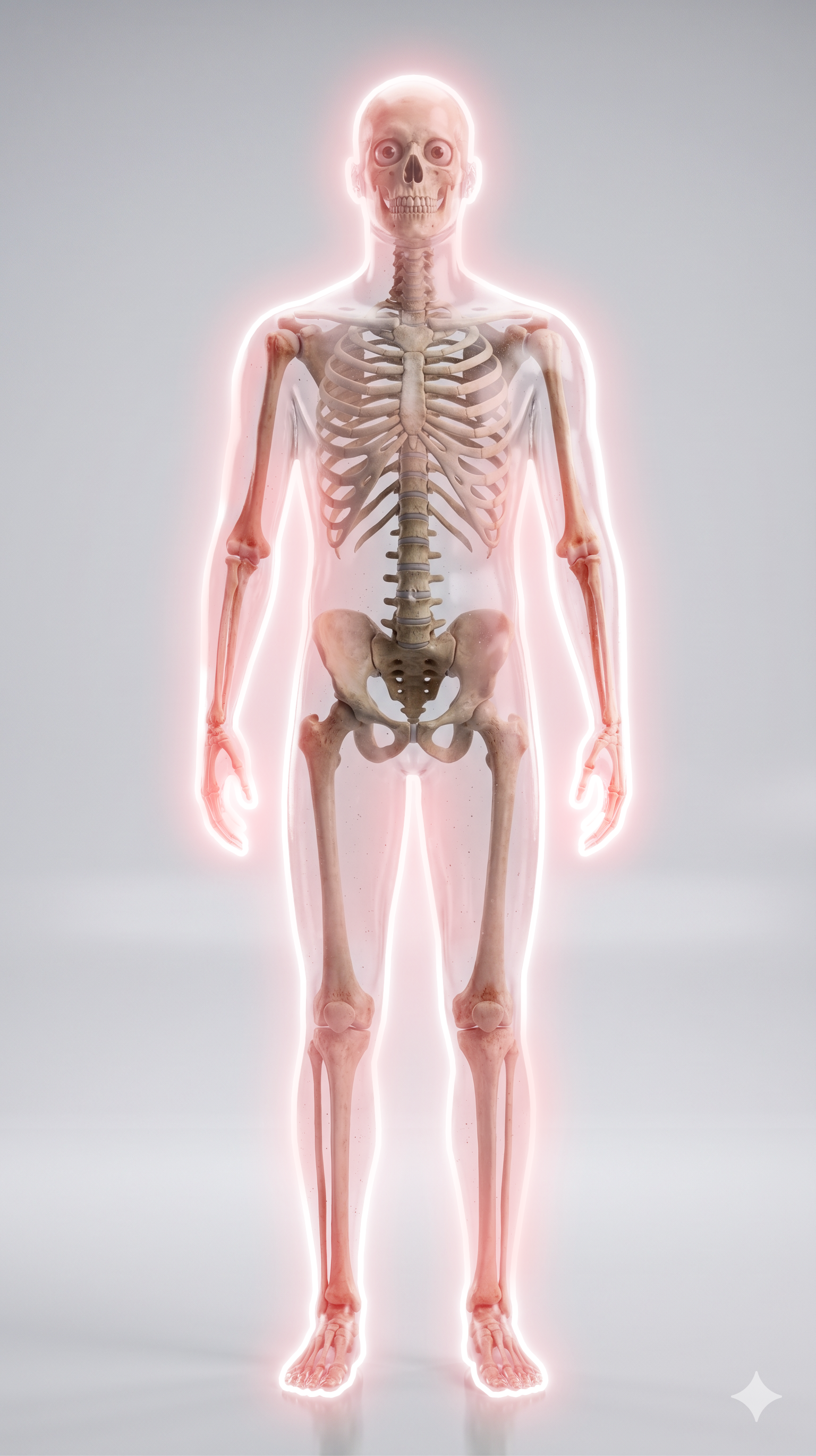
Look at the examples before opening the editor: neon does not need to cover everything. It should point the eye toward the person, object, or word that matters and create contrast with the background. Use one dominant color and at most one supporting color with a clear purpose. Each example below combines line, aura, and painted lighting differently.
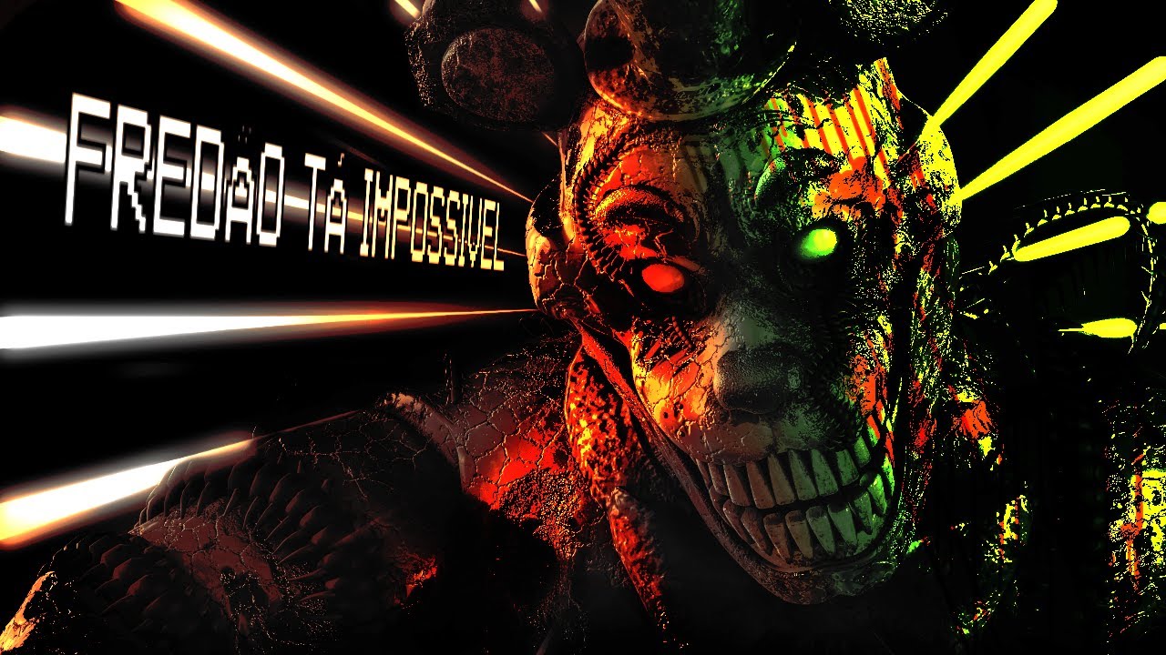
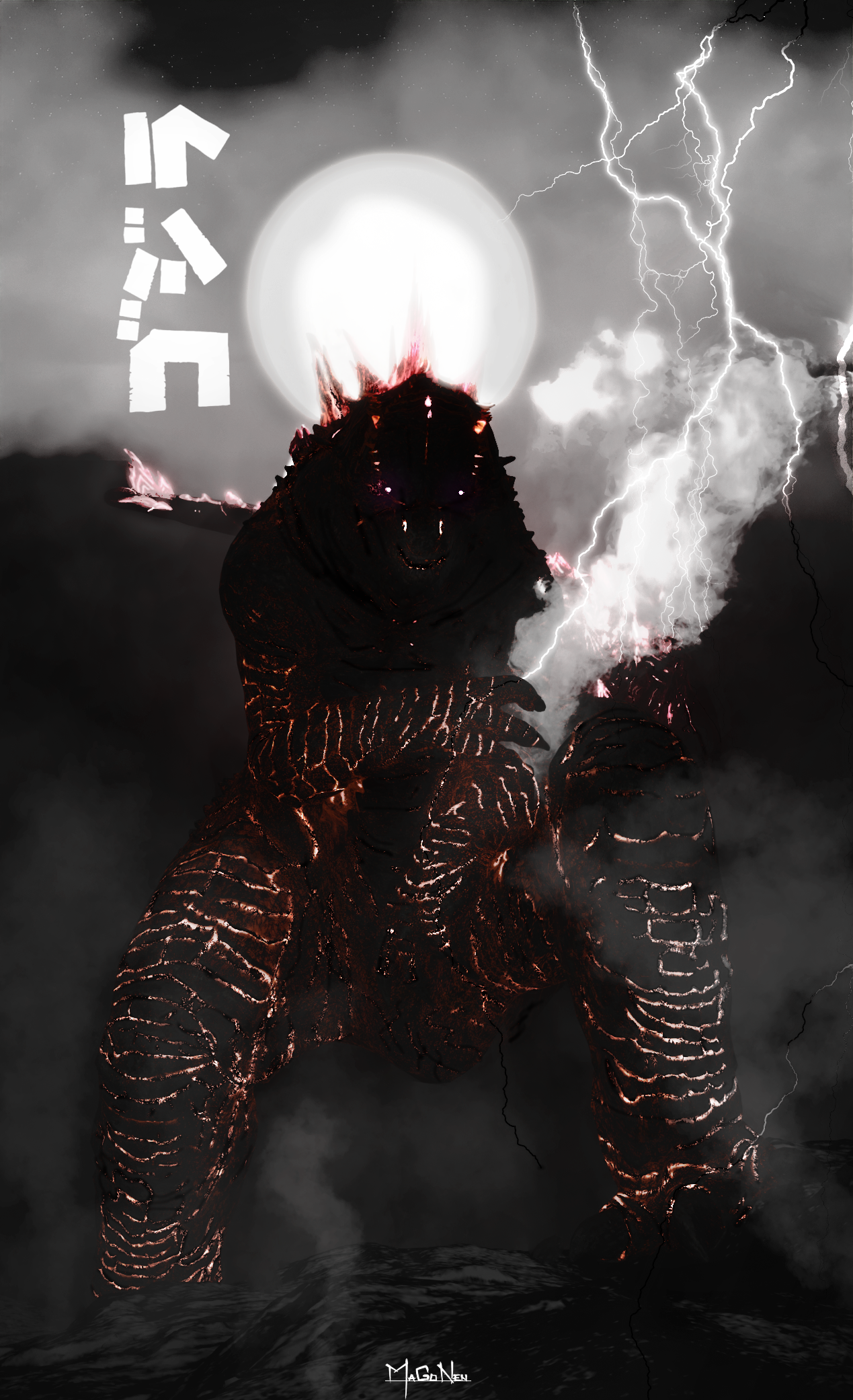
Before starting: a clean cutout and a light direction
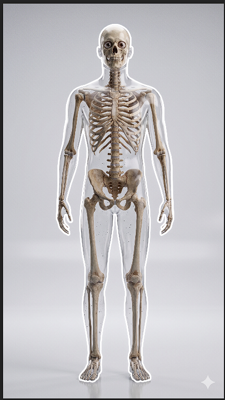
Start with a subject that already separates from its background. If the background is busy, remove it or darken it before adding neon; trying to repair poor separation with glow usually washes the image out. Use the starting image as a map: decide whether the source is left, right, above, or behind. That choice controls every later step.
Do not automatically outline the entire object. Side light usually hits only part of a face, shoulder, hair, clothing, or object edge. Leaving some areas without neon keeps volume intact. Zoom out often and check whether the subject still reads at thumbnail size.
1. Build the path with the Pen Tool
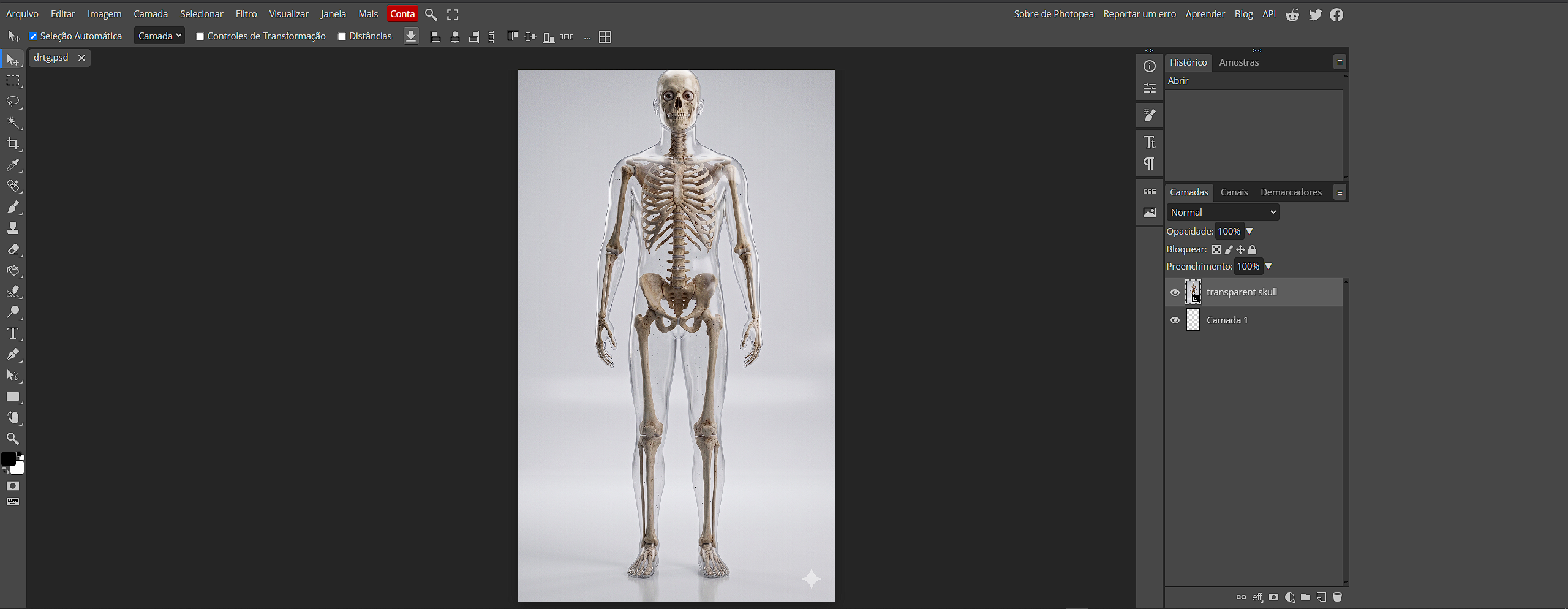
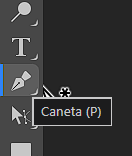
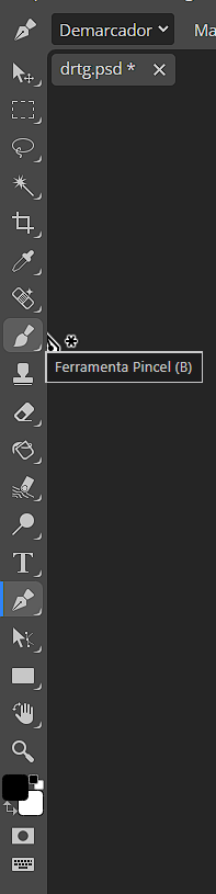
Create an empty layer named Outline. Keep it above the cutout but separate from the original image so you can erase, duplicate, and test without damage. Select the Pen Tool in path mode. Click for straight points; click and drag for handles that control curves. Follow meaningful curves, but do not place dozens of tiny points: fewer well-adjusted points make a cleaner outline.
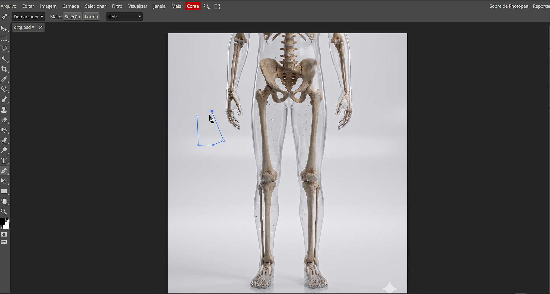
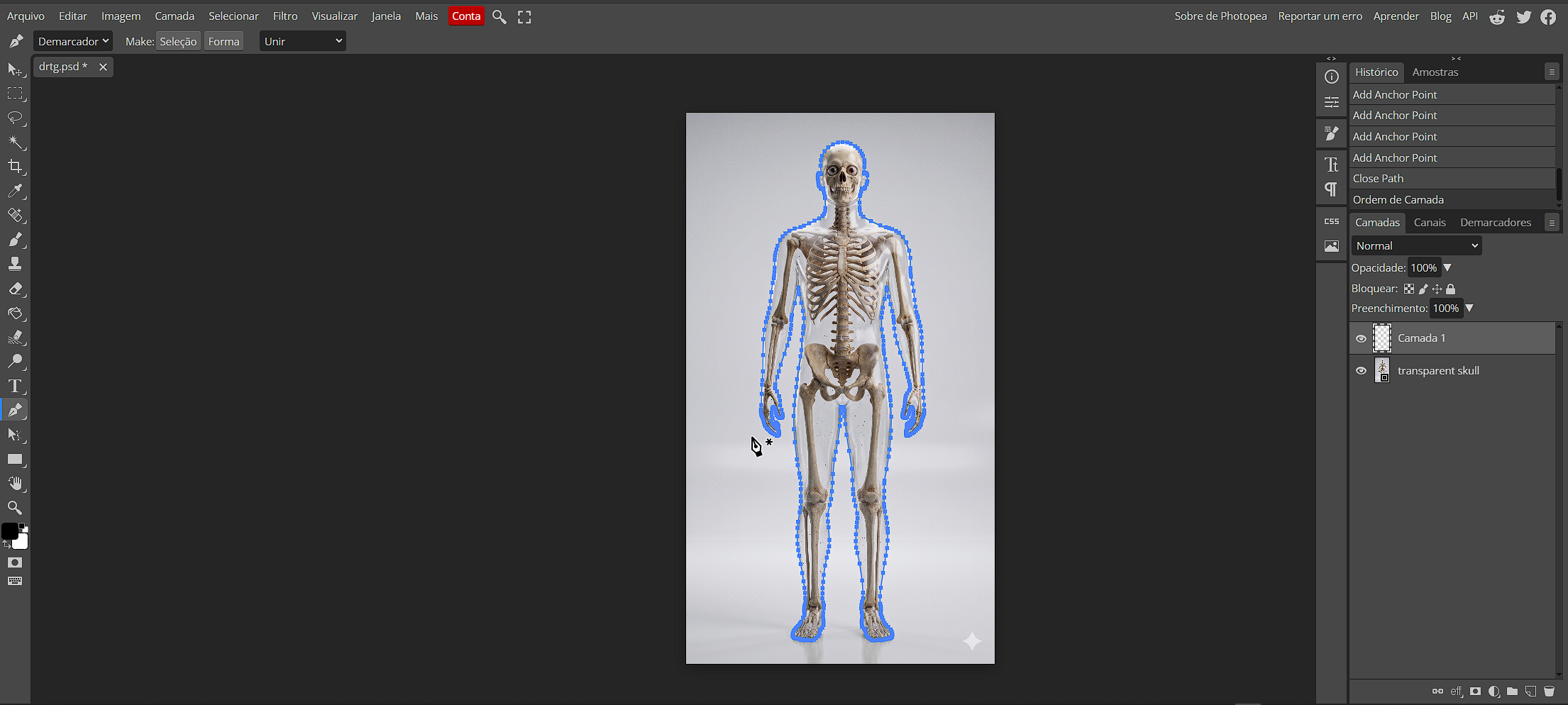
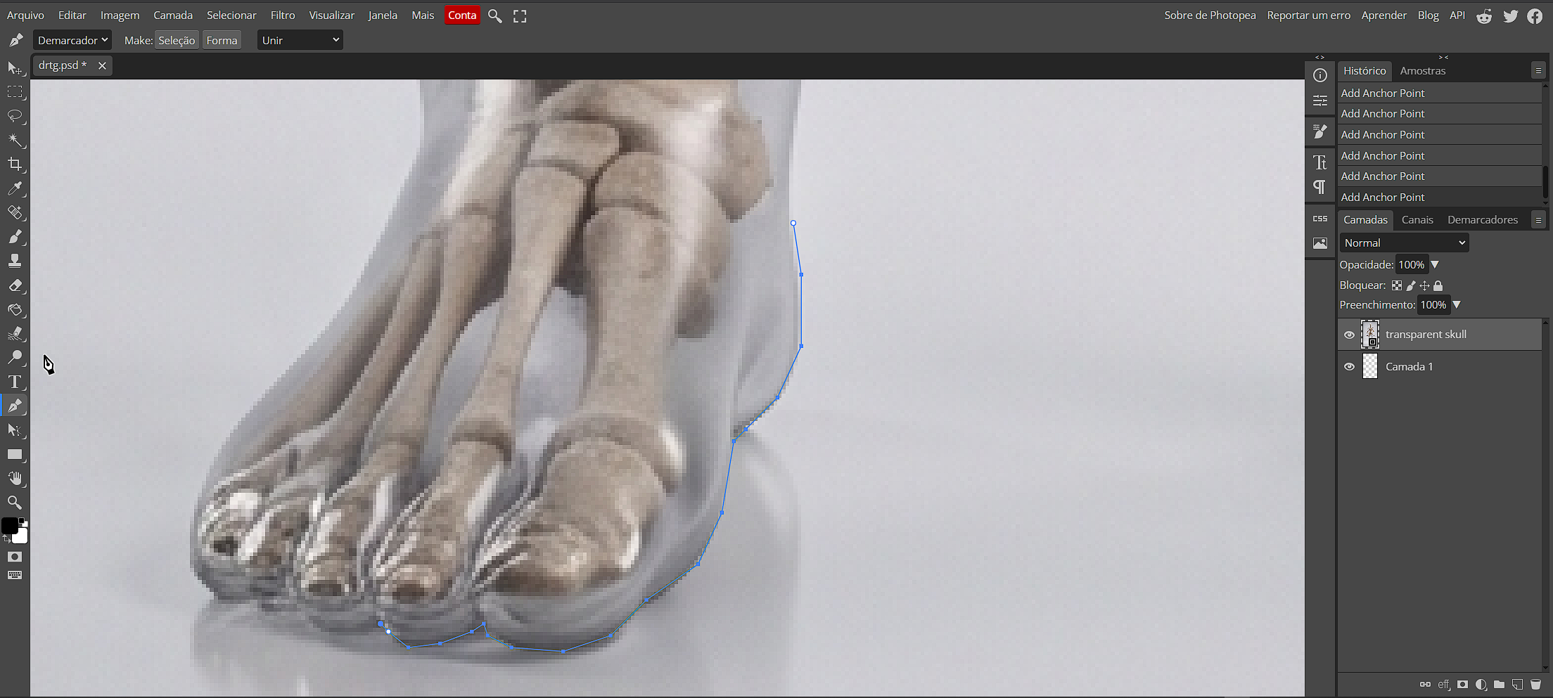
Check that the path follows the subject volume. You can outline only the lit side or make separate parts for hair, face, and clothing. Configure a soft brush with a document-appropriate size and a white or very light color. White is useful because Outer Glow can provide the final color without contaminating the base stroke.
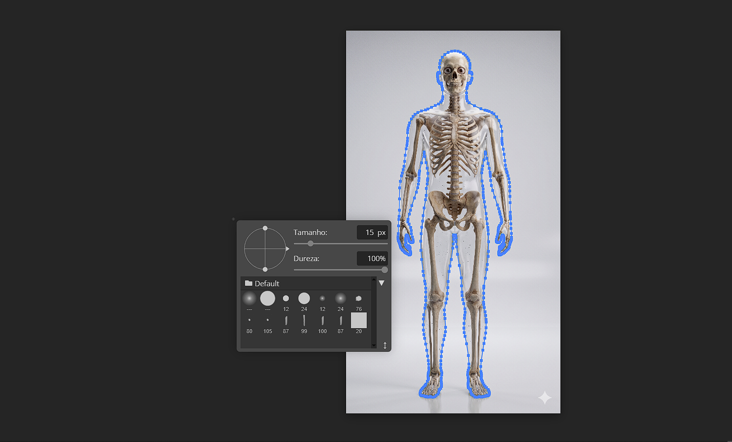
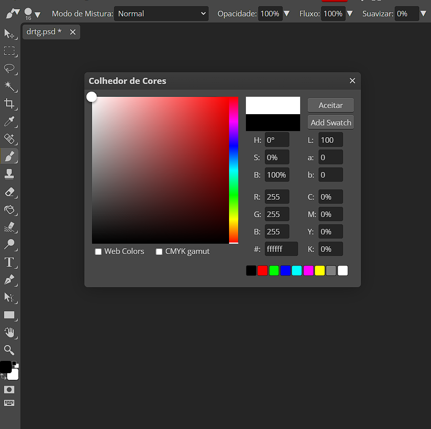
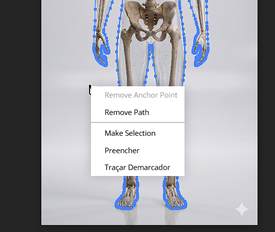
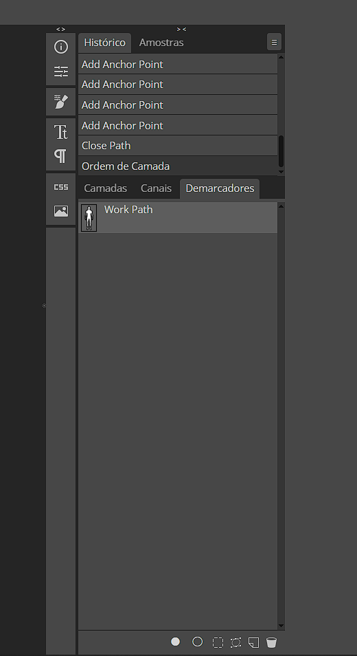
With Outline selected, use the path menu or right-click the path and choose Stroke Path. Select Brush Tool in the dialog—not Eraser, Pencil, or another tool—and confirm. Photopea uses the exact brush thickness, softness, and color you just set. Finally hide the Paths panel; those vector lines are editing guides, not part of the finished artwork.
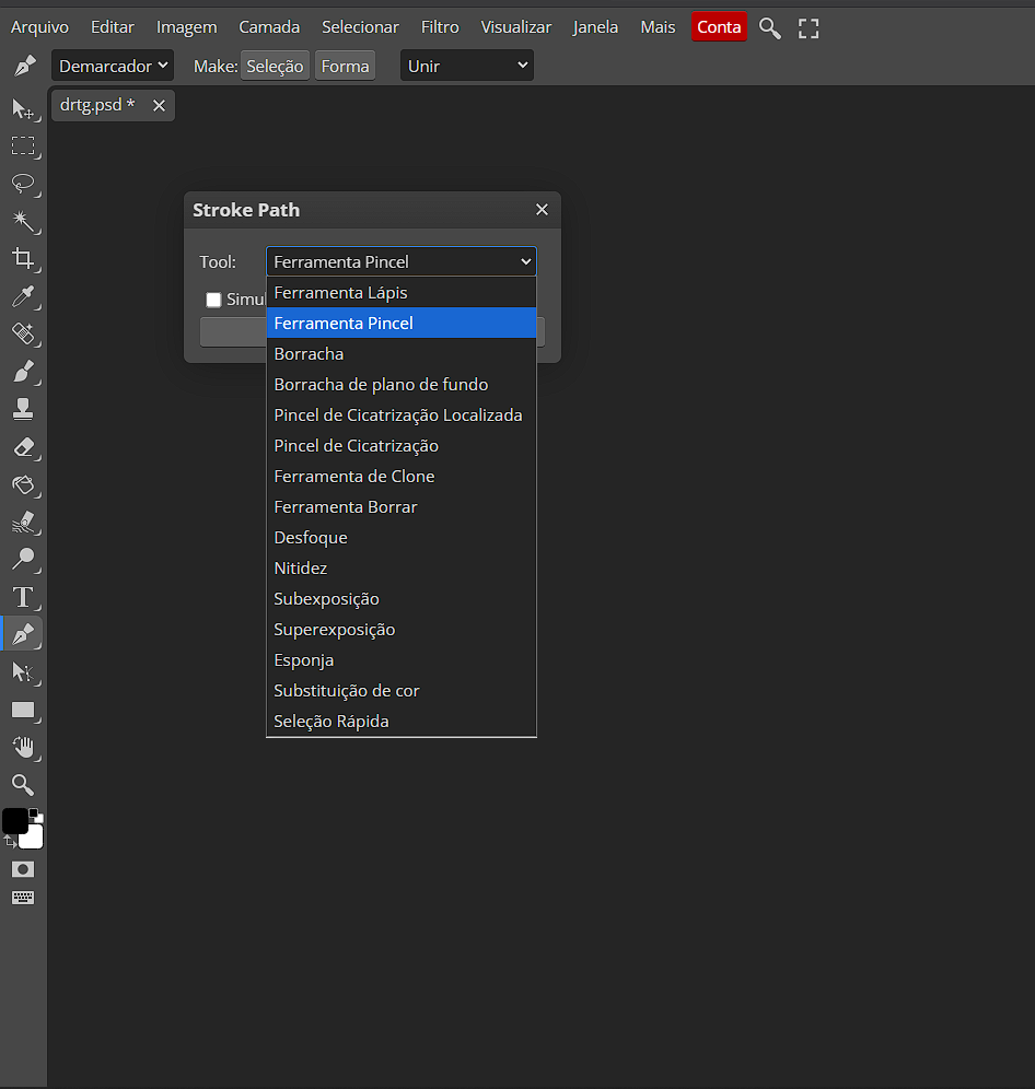
2. Turn the line into controllable neon glow
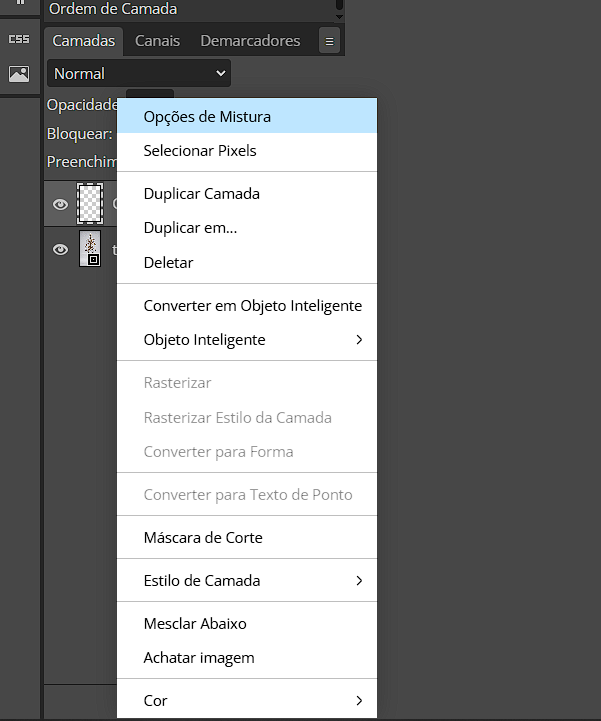
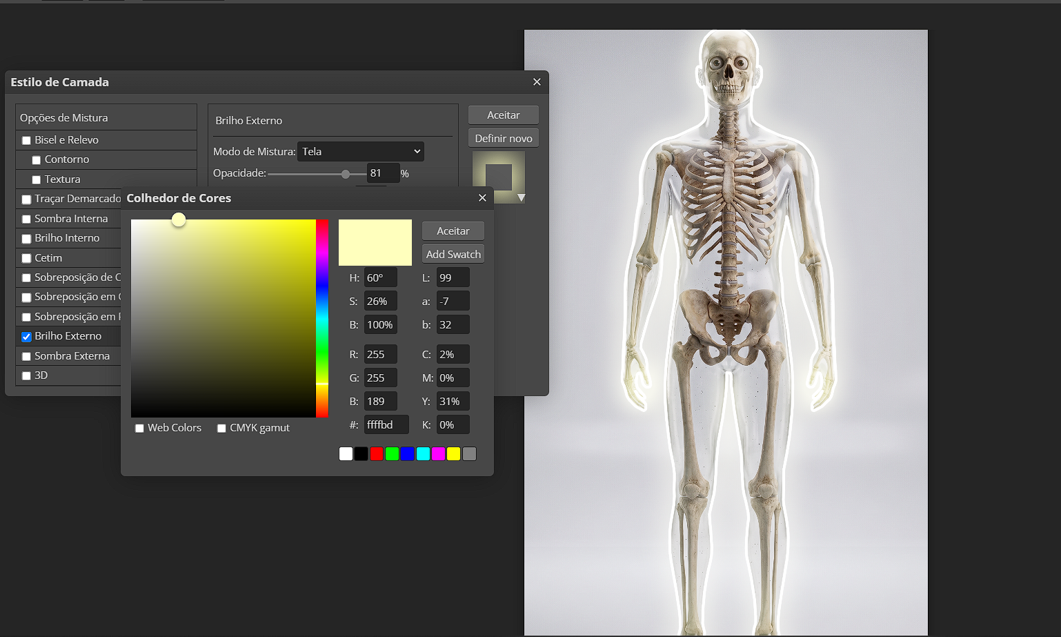
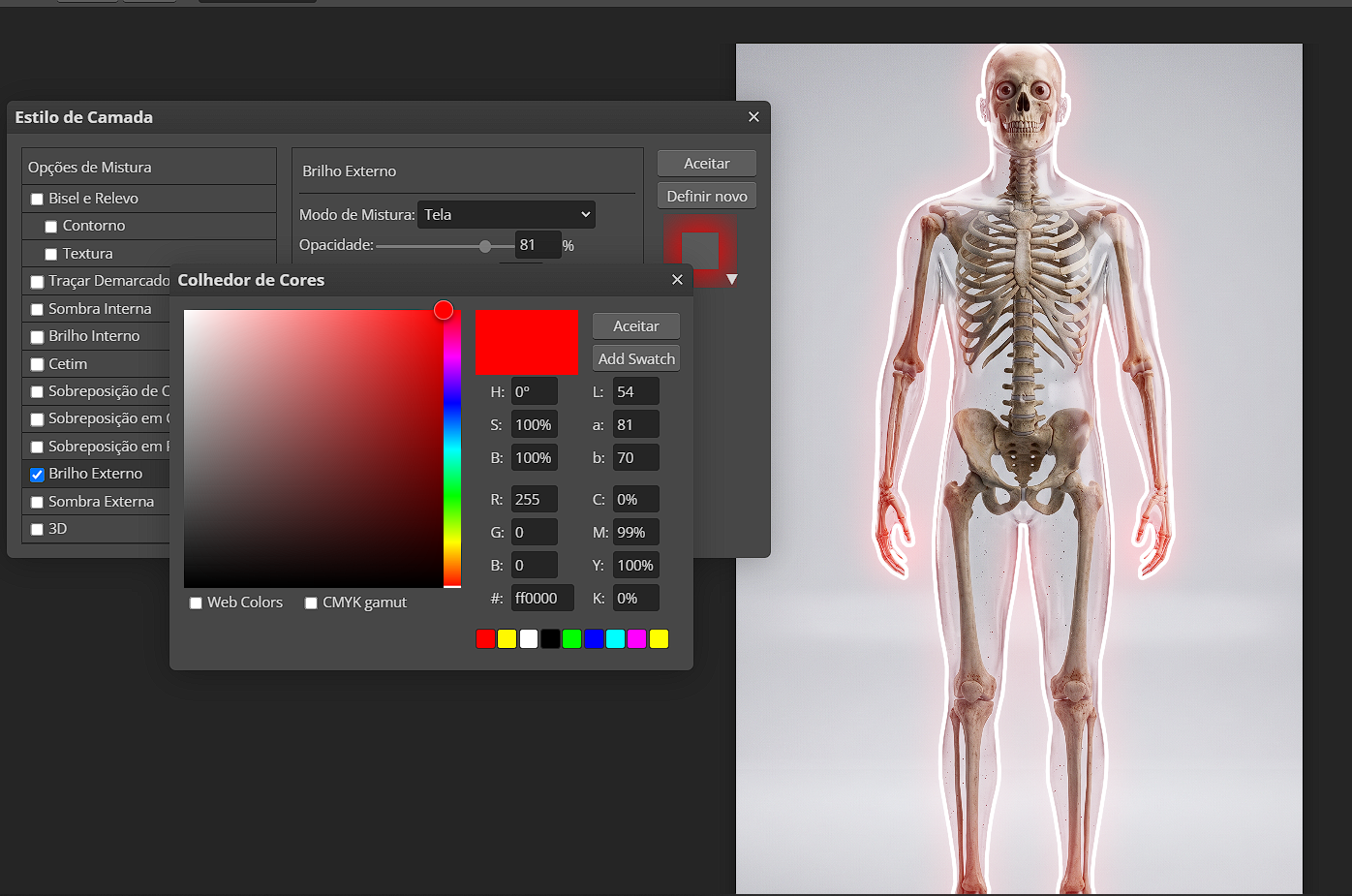
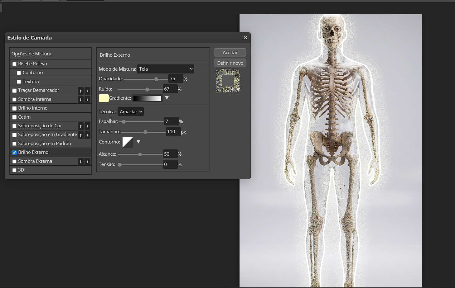
The Outline is still only a line. Right-click its layer, open Blending Options, enable Outer Glow, and open its settings. Color gives the light its identity. Start with one color that belongs with the background—red for tension, green for sci-fi, blue for a cold scene, yellow for energy—instead of mixing several colors without a reason.
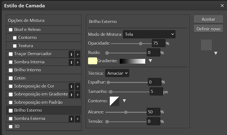
Opacity controls visibility. Spread concentrates the intense part near the stroke: more spread looks drier and more defined. Size expands the soft area around it: more size sends the light farther, but makes it less concentrated. Adjust all three together while looking at the complete image. Noise is optional; a touch can add texture, but too much makes the glow look dirty.
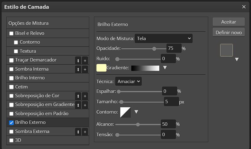
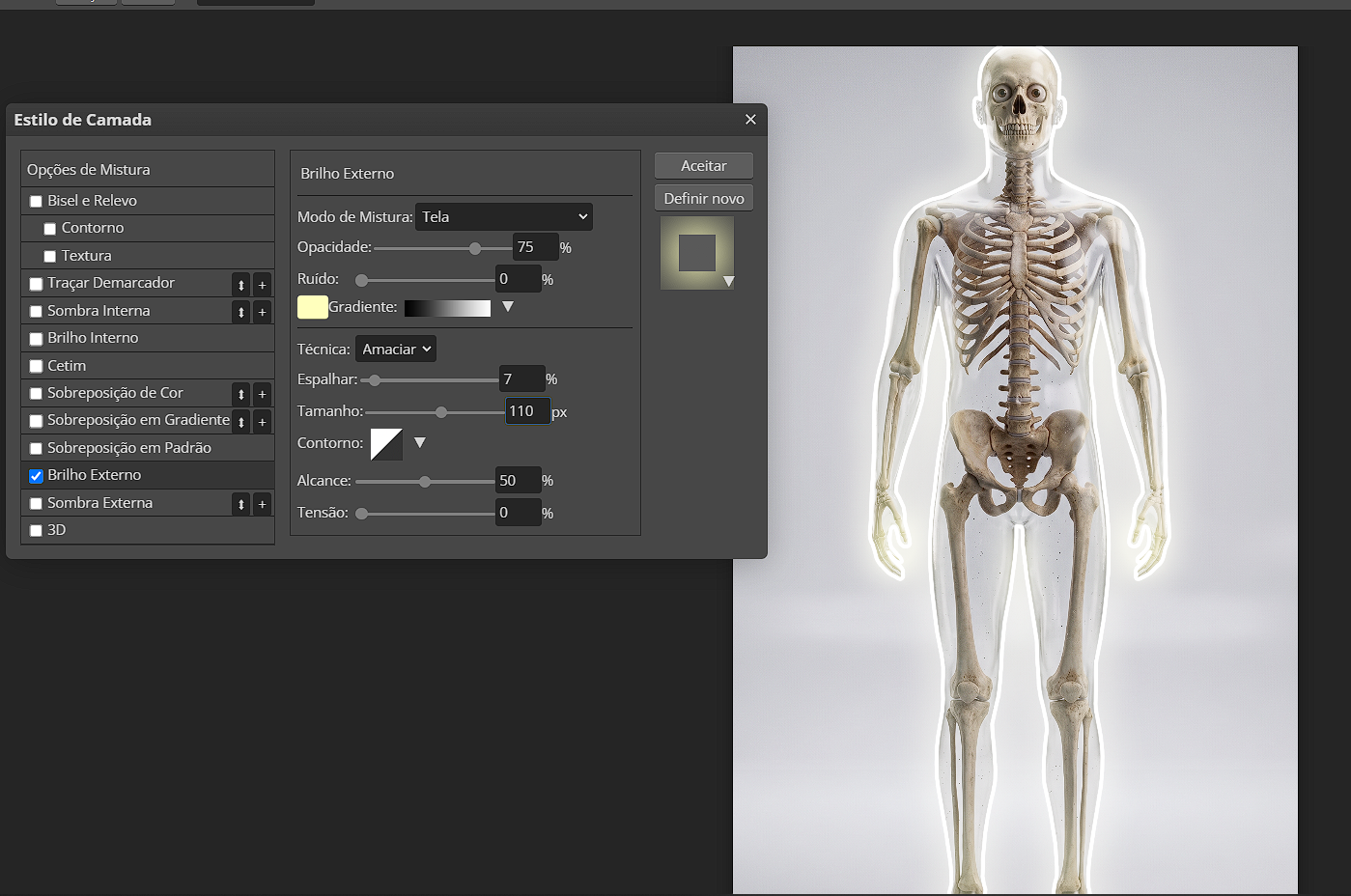
If the first try feels artificial, it is rarely because it lacks glow. Usually there is too much color, too much size, or light on an edge that should stay dark. Return to the path and remove segments if needed. The goal is light touching the object, not a sticker placed on top of it.
3. Build depth with duplicates and Gaussian Blur
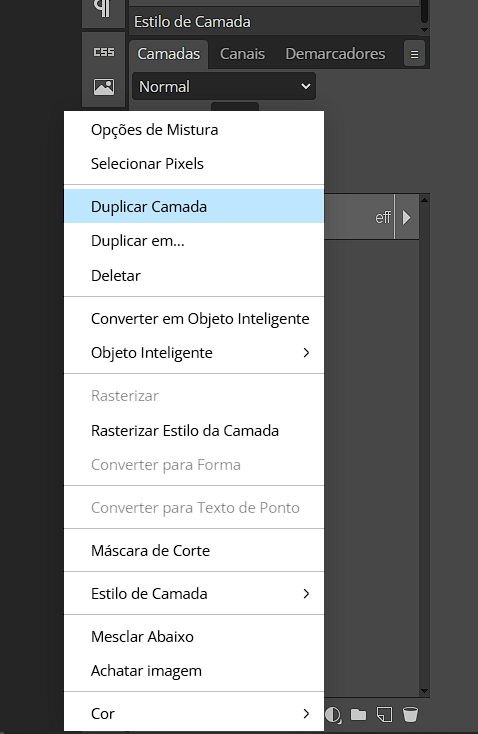
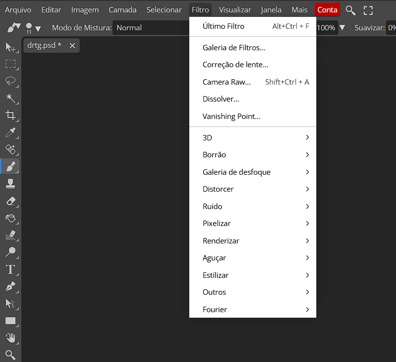
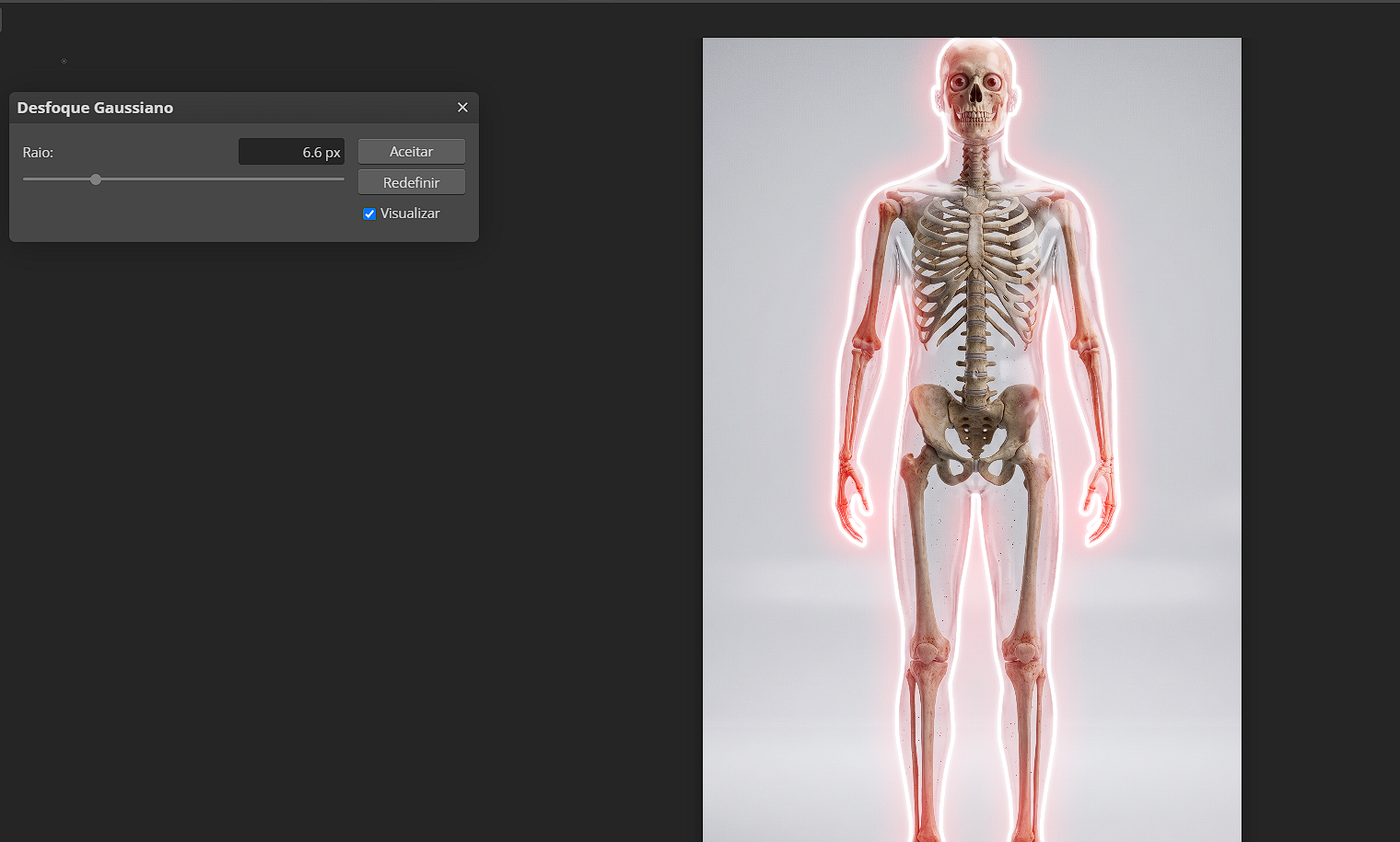
Duplicate the Outline before blurring it. Keep one sharp copy on top for readability and work with copies below it. Go to Filter > Blur > Gaussian Blur. Do not use one giant blur; create three light distances instead. A 6.6 copy stays near the edge, 11 makes a middle transition, and roughly 30 creates the wide aura.
Those values are a starting point, not a rule. Small files need less; 4K artwork may need more. The useful test is to toggle each copy on and off: each one should have a job. If the widest copy turns hair, clothing, or text into a shapeless cloud, lower its opacity before discarding the blur.
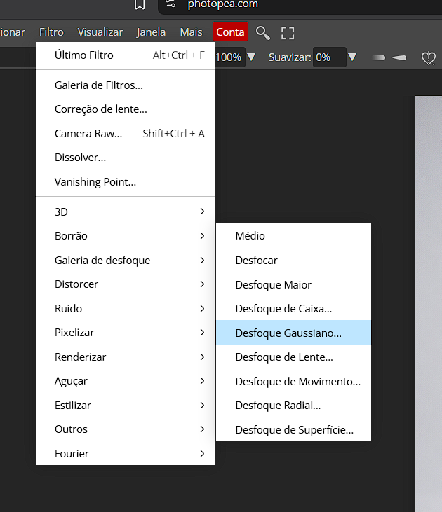
Name the layers “sharp outline,” “blur 6.6,” “blur 11,” and “blur 30.” It makes later changes obvious and lets you recolor the outline without rebuilding the whole effect.
4. Paint the lighting that makes neon feel real
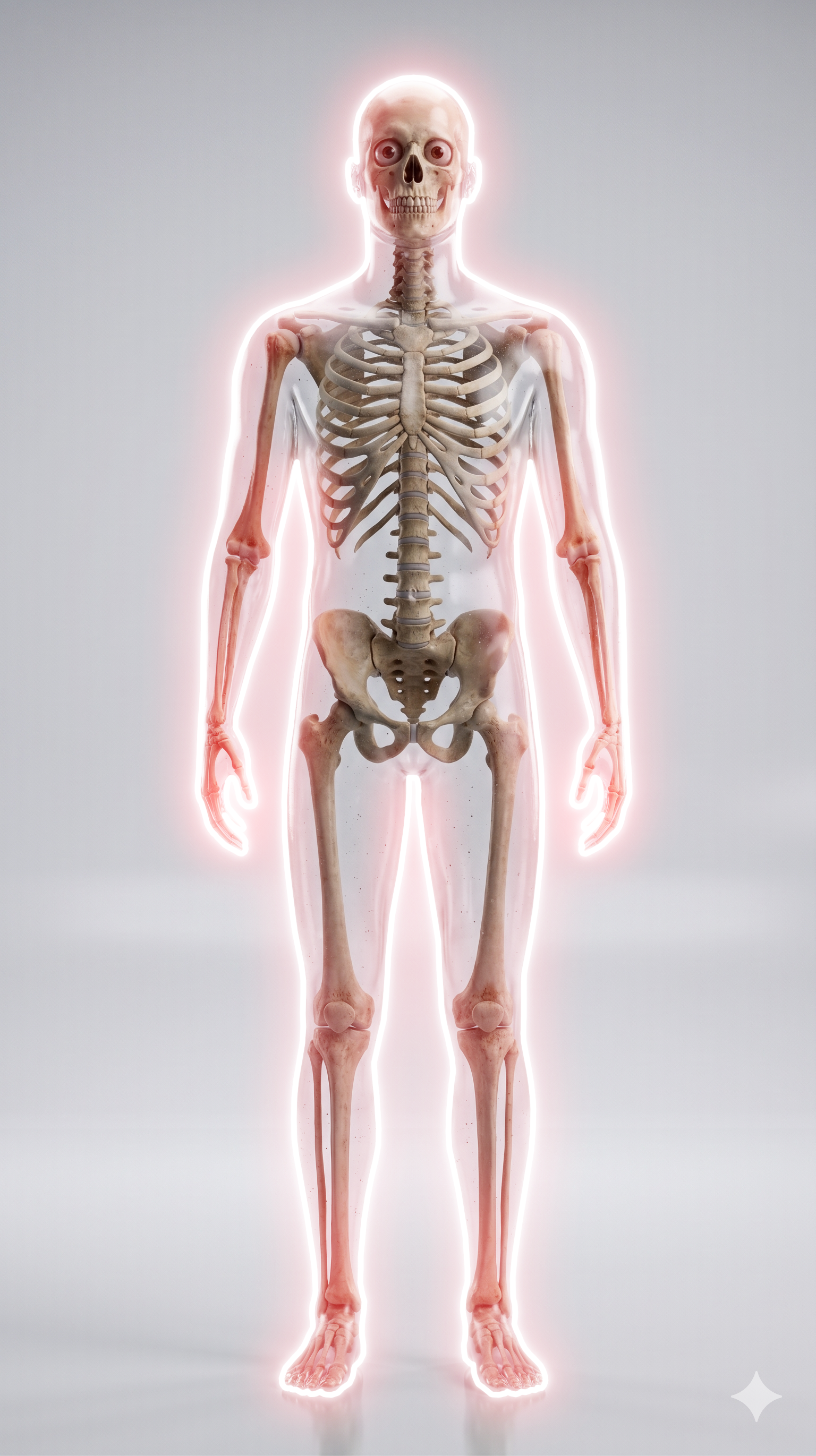
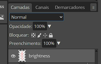
Create a new empty layer above the subject named Brightness. Use a large zero-hardness brush and pick a lighter version of the neon color. If the outline is red, use a very light pink or warm near-white; if it is blue, use pale cyan. Paint only planes facing the source: clothing edges, cheek, object sides, and raised parts.
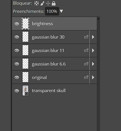
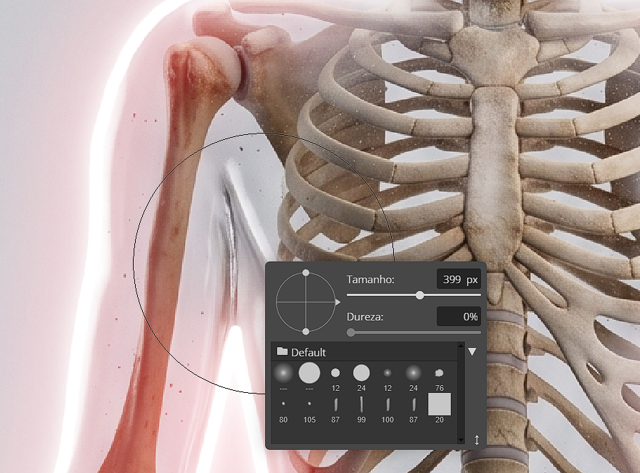
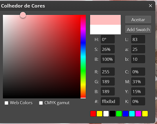
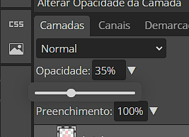
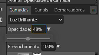
The stroke will look too strong at first—that is expected. Change the Brightness layer to Vivid Light and reduce opacity. Around 30–35% is a safe starting point, but the image decides the final value. Soft Light, Screen, Overlay, and Linear Light are useful alternatives when Vivid Light clips tones or makes contrast harsh.
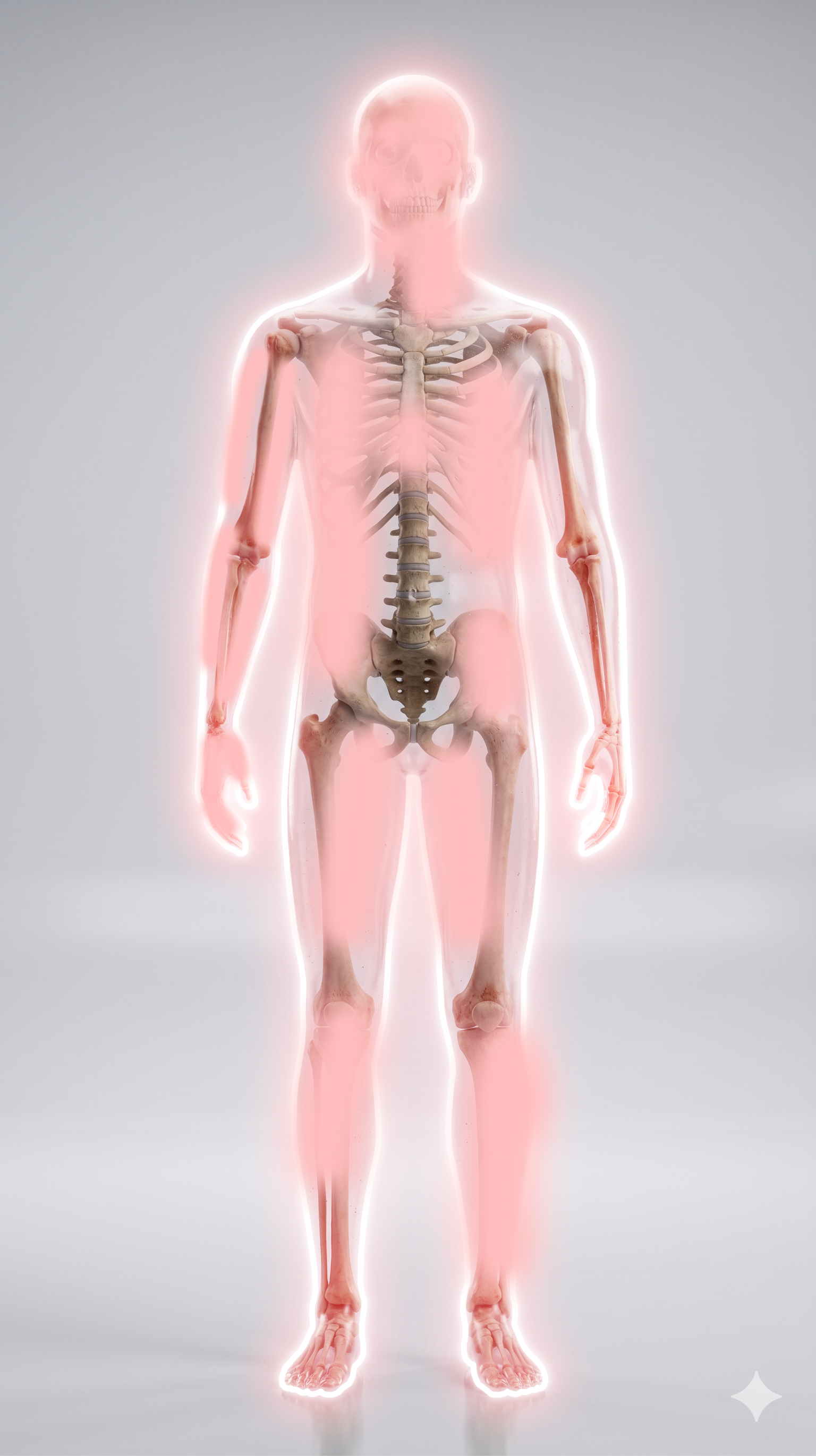
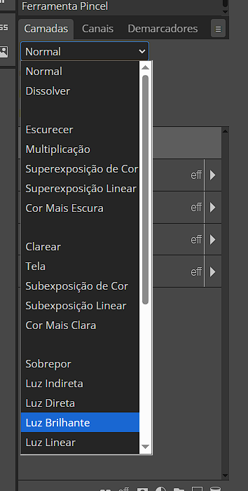
Turn the outline off for a moment. If the painted lighting still suggests a source by itself, the direction works. Turn both layers back on. A low-opacity gradient map can bring background and subject colors together, but it should unify rather than tint everything equally.
5. Final review: contrast, readability, and export
Inspect at 100% for hard edges, then reduce the image to the size where it will be seen. For a thumbnail, the silhouette, face, or main object must remain clear within a few centimeters. If neon competes with text, reduce the aura behind the letters. If the background still beats the subject, darken it or increase local contrast before adding more glow.
Save the layered PSD/Photopea file before flattening. Export at the exact target size, check that dark tones did not crush detail, and compress a final copy instead of repeatedly re-exporting the same JPEG.
Prepare and finish the image locally
Use Background Remover for a clean cutout, AI Upscaler for a small source, Image Resizer for each delivery format, and Image Compressor for a lighter final file. The visual method is identical in any editor: path or selection, base stroke, outer glow, blurred duplicates, and painted directional light.
 Converter Lab
Image converter
Convert batches of photos, artwork, and icons into formats for your destination.
Background Remover
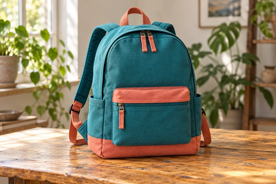
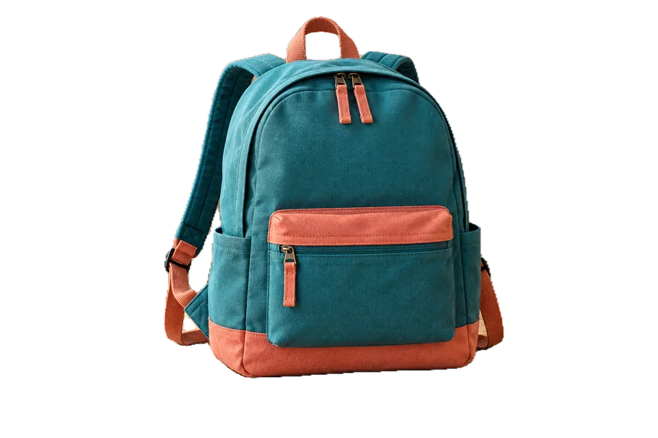
Remove backgrounds from people, products, and objects with an adjustable mask. Use BiRefNet Lite for varied objects and export transparent PNG or WebP.
AI Upscaler
Enlarge photos, illustrations, and anime with AI models, before-and-after comparison, and batch processing.
Image Compressor
Reduce the size of photos, graphics, and images with visual comparison, adjustable quality, and batch processing.
Image Resizer
Resize image batches by pixels, percentage, or maximum limits. Adjust aspect ratio, framing, and output format.